South Africa is home to 63 million people. About 81.7% of them are black, 8.5% coloured, 2.6% Indian/Asian and 7.2% white. Find out more about birth, death, age, HIV, migration and other population trends.

A child plays in a restaurant in Vosloorus, a large township in Gauteng province. (Media Club)
The country has the sixth largest population in Africa – after Nigeria, Ethiopia, Egypt, the Democratic Republic of the Congo and Tanzania – and the 24th largest in the world.
Jump to:
![]()
![]()
![]()
![]()
![]()
![]()
![]()
South Africa’s population: overview
According to Statistics South Africa’s 2024 mid-year population estimates, South Africa is home to 63,015,904 people.
Black people are in the majority, with a population of 51.5 million – 81.7% of the total. The remaining 18.3% is made up of 5.3 million coloured people (8.5%), 1.6 million Indian/Asian people (2.6%) and 4.5 million white people (7.2%).

These ratios have changed since the country became a democracy in 1994. The percentage of black people has increased, that of coloured and Indian/Asian people has stayed roughly the same, while the share of white people has shrunk.
The 1996 census, the first of the democratic era, recorded a population of 40.6 million. Black people made up 76.7% of the total, coloured people 8.9%, Indian/Asian people 2.6%, white people 10.9% and an uncategorised group 0.9%.
In about 2013 the coloured population overtook the white population as South Africa’s second-largest group.
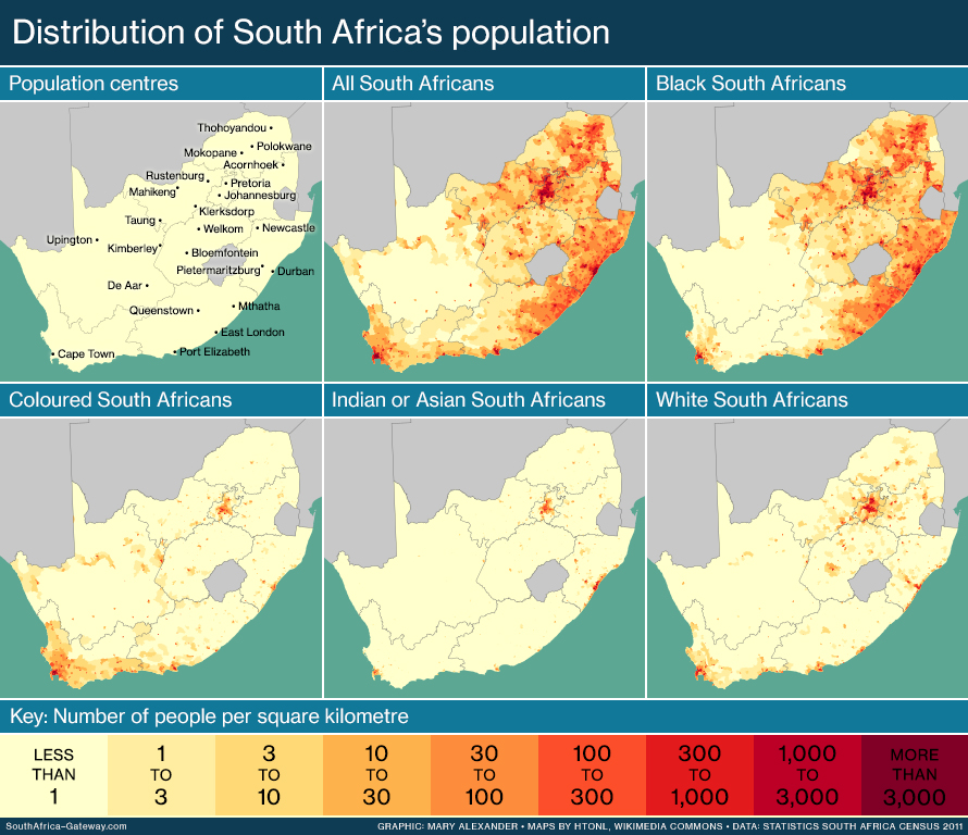
READ MORE: Geographic distribution of South Africa’s races
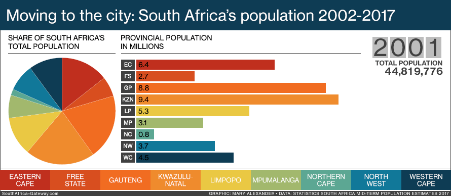
Population of the provinces
The population of South Africa’s nine provinces varies enormously.

The most striking difference is between Gauteng and the Northern Cape. Gauteng is a city region of just 18,178 square kilometres – 1.4% of South Africa’s land area – yet it’s home to over a quarter of the country’s people. The arid and rural Northern Cape takes up almost a third of South Africa, but only 2.2% of the population live there.
Then there’s KwaZulu-Natal, home to almost a fifth of the population, and the larger Free State, home to only 4.8%.

Data source: Statistics South Africa Census 2022
In 2024 South Africa’s provincial populations, and their share of the total, were:
- Eastern Cape: 7,176,230 (11.4%)
- Free State: 3,044,050 (4.8%)
- Gauteng: 15,931,824 (25.3%)
- KwaZulu-Natal: 12,312,712 (19.5%)
- Limpopo: 6,402,594 (10.2%)
- Mpumalanga: 5,057,662 (8.%)
- Northern Cape: 1,372,943 (2.2%)
- North West: 4,155,303 (6.6%)
- Western Cape: 7,562,588 (12.%)
READ MORE: The nine provinces of South Africa
Population density
South Africa’s population density is about 46 people per square kilometre, according to 2017 data.
In the provinces, differences in size and population mean different population densities. Gauteng, small but populous, has an average of 785 people for every square kilometre. KwaZulu-Natal has 117 people per square kilometre. The empty Northern Cape has just three people for each square kilometre.

READ MORE: The nine provinces of South Africa
Life, death and HIV
The 2024 estimate of average life expectancy at birth in South Africa is 66.5 years – 69.2 years for females and 63.6 years for males. This is up from a predicted life expectancy of 54.7 years in 2002, before any serious effort to tackle the HIV and Aids epidemic began.
The crude birth rate is 19.6 babies born for every 1,000 people. The total fertility rate is an average of 2.4 babies born to a woman over her lifetime. The crude death rate is 8.7 per 1,000.
Infant mortality (babies who die in their first year of birth) is 22.9 deaths for every 1,000 live births. The under-five mortality rate is 28.6 deaths per 1,000 live births.
These rates show an improvement on child survival since 2002, when infant mortality was 57 deaths and under-five mortality 79.7 deaths per 1,000 live births.
Some 8 million people are HIV positive, making up 12.7% of South Africa’s total population of 63 million. Women are hardest hit by the disease: over a fifth (20.5%) of all women aged 15 to 49 are HIV positive.
The total HIV prevalence rate was lower in 2002, at 8.9% of the population. The higher rate in 2024 reflects progress in the rollout of antiretroviral therapy, as more people live with HIV instead of dying of Aids.
READ MORE: HIV and Aids in South Africa
Age structure
South Africa has 17.3 million children aged 14 or younger, making kids the largest age group in the country and nearly a third (27.5%) of the population.
Poorer provinces tend to have a larger share of children and wealthier provinces a smaller share. In the Limpopo 33.1% of the population is aged 0 to 14 and in the Eastern Cape it’s 31.7%. By contrast, children make up 23% of Gauteng’s population and 22.9% of the Western Cape’s.

For the country as a whole, the second largest age group is from 30 to 44 (24.8%), closely followed by 15 to 29 (24.2%). Older groups are smaller: 13.8% are 45 to 59, 7.5% aged 60 to 74, and 2.2% 75 or older.
Age and race

Click image to find out more.
Data from 2017 reveals that when it comes to age structure and race, South Africa’s population reflects the facts of history and continued inequality.
While black South Africans are in the majority in every age group, this majority decreases as the age of the population rises. Coloured, Indian and especially white South Africans tend to live longer.

Click to view from the start.
Migration
Click image to find out more.
South Africans migrate away from poverty to where the jobs are. They move from poorer provinces to the richer ones, and from rural areas to the cities.
Gauteng is South Africa’s wealthiest province, mostly a city region and the centre of the country’s economy. It has the largest population, constantly swelled by migration.
In the 10 years from mid-2011 to mid-2021, net migration (number of people moving in minus people moving out) into Gauteng increased the province’s population by almost 1.9 million people.
The Western Cape, the third-largest provincial economy with the lowest poverty level, had net migration of 646,529 over the same 10 years. Conversely, KwaZulu-Natal – the second-largest – lost 18,333 of its people to migration from 2011 to 2021. While the province has a large economy, it also has relatively high levels of poverty.
The Eastern Cape has, by far, the highest level of poverty of all the provinces – and the highest number of people moving elsewhere. Its net migration for 2011 to 2021 was a negative 603,044. Limpopo had the second-highest rate of outward migration, at -300,527.
Net migration (people moving in minus people moving out) for South Africa’s provinces, 2011 to 2021:
- Eastern Cape: -603,044
- Free State: -23,128
- Gauteng: 1,856,006
- KwaZulu-Natal: -18,333
- Limpopo: -300,527
- Mpumalanga: 178,386
- Northern Cape: 17,063
- North West: 228,675
- Western Cape: 646,529
Click animation to view from the start.
READ MORE: The nine provinces of South Africa
International migration
South Africa’s international migration rates tend to be positive – more people move here, particularly from the rest of Africa, than leave.
From mid-2011 to mid-2021 net international migration into the country was 2.7 million. Most of the migrants (2.8 million) were from elsewhere in Africa, with a further net migration of 176,120 Indian/Asian people.
The total was offset by the net loss of 286,611 white people to other countries.
Net international migration for South Africa, 2011 to 2021:
- African: 2,850,656
- Indian/Asian: 176,120
- White: -286,611
- Total: 2,740,165
Trends in South Africa’s population from 1960
Age structure
There’s a lot of talk of South Africa’s population being dominated by the youth. But as the graphic below shows, we’re less youthful than we have been for decades.

The end of apartheid, better healthcare, widespread social welfare and greater economic opportunities all mean South Africans are now able to live longer lives – reducing the proportion of children and youth in our total population. See the actual figures for selected years.
READ MORE: Infographic: South Africa’s population and age structure from 1960 to 2015
Urbanisation
From 1960 to the late 1980s, apartheid laws kept families and communities in poor rural areas. Young men alone were allowed to move to the cities, where their labour was valuable.

After the end of apartheid, from the mid-1990s, urbanisation increased rapidly. In the last 20 years, much of the migration from rural areas has been to Johannesburg, South Africa’s largest city since 1950.
READ MORE: Infographic: South Africa’s urban and rural population from 1960 to 2015
Life expectancy
Charting South Africans’ life expectancy is to track the country’s modern history. In 1960, a time of terrible apartheid abuse, an average newborn child was expected to have a lifespan of only 52 years – 50 years for boys. In 2015, life expectancy was 62 years.

In between, life expectancy has risen and fallen. The most severe drop was during the crisis of the HIV and Aids epidemic from 1995 to 2005. In 2005, life expectancy was the same as it had been in 1960.
READ MORE: Infographic: Life expectancy in South Africa from 1960 to 2015
Child mortality
The death rate of children is the starkest indicator of the health of a country’s society and economy. In 1974 South Africa’s mortality rate – deaths per 1,000 live births – was 88.1 for infants under a year and 125.5 for under-fives. By 2016 it had dropped to 34.2 for infants and 43.3 for under-fives – the lowest rate yet recorded.

READ MORE: Infographic: Child mortality in South Africa from 1974 to 2016
Researched, written and designed by Mary Alexander. Updated March 2026.
Comments? Email mary1alexander@gmail.com
Categories: People
You must be logged in to post a comment.