South Africa’s population
South Africa is home to 63 million people. About 81.7% of them are black, 8.5% coloured, 2.6% Indian/Asian and 7.2% white. Find out more about birth, death, age, HIV, migration and other population trends.

South Africa is home to 63 million people. About 81.7% of them are black, 8.5% coloured, 2.6% Indian/Asian and 7.2% white. Find out more about birth, death, age, HIV, migration and other population trends.
South Africa has nine provinces, each with its own history, landscape, population, languages, economy, cities and government.

Nelson Mandela was born in 1918 and died, aged 95, in 2013. His family tree remains, growing from three wives and six children to 17 grandchildren, 19 great-grandchildren and on …

Where are South Africa’s poorest places? Two maps find the patterns of poverty: one shows the share of households living in poverty in each municipality, the other the number of poor people living there. And an animation tries to make sense of the maps.

Before South Africa became a democracy in 1994, apartheid divided the country into four large provinces for white people, and 10 small unsustainable “homelands” for black people.

Local government in the Eastern Cape is organised into eight major municipalities. Two are metropolitan, and the other six are district municipalities. The districts are further divided into 31 local municipalities.

Local government in the Free State is organised into five major municipalities. One is metropolitan, and the other four district municipalities. The districts are further divided into 19 local municipalities.

Local government in KwaZulu-Natal is organised into eight major municipalities. One is metropolitan, and the other 10 are district municipalities. The districts are further divided into 43 local municipalities.

Local government in Limpopo is organised into five district municipalities. The province also has 22 smaller local municipalities, each falling under one of the five district municipalities.

Local government in Mpumalanga is organised into three district municipalities. The province also has 17 smaller local municipalities, each falling under one of the district municipalities.

Local government in the Northern Cape is organised into five district municipalities. The province also has 26 smaller local municipalities, each falling under one of the five district municipalities.

Local government in North West is organised into four district municipalities. The province also has 18 smaller local municipalities, each falling under one of the four district municipalities.

Local government in the Western Cape is organised into six major municipalities. One is metropolitan, and five are district municipalities. The province also has 24 smaller local municipalities, each falling under one of the five districts.

The distribution of South Africa’s population groups reveals the country’s history. Find out more with these maps of where black, coloured, Indian and white South Africans live today, according to the 2011 census.

Charting South Africans’ life expectancy is to track the country’s modern history. In 1960, when the state was grimly implementing apartheid laws, an average newborn child was expected to have a lifespan of only 52 years – 50 years for boys. In 2015, life expectancy was 62 years.
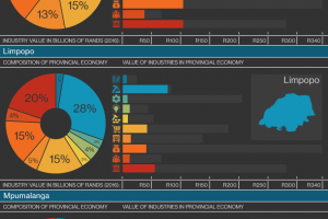
Finance is the biggest industry in Gauteng and the Western Cape. Mining dominates in Limpopo, Mpumalanga, North West and the Northern Cape. KwaZulu-Natal’s major industry is manufacturing. In the Eastern Cape and Free State, it’s government services.
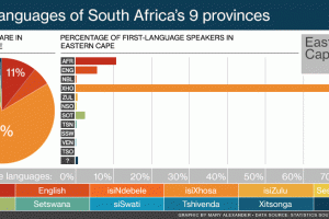
The home language of most people in KwaZulu-Natal is, unsurprisingly, isiZulu. In the Eastern Cape it’s isiXhosa. Around half the people of the Western Cape and Northern Cape speak Afrikaans. In Gauteng and Mpumalanga, no single language dominates.
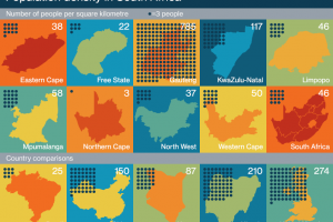
Gauteng, small but crowded, has an average of 785 people per square kilometre. The empty but enormous Northern Cape has a population density of only three people for each square kilometre.
This is an animation to break your heart. In any unequal society, the privileged live long lives and everyone else much shorter lives.
South Africans migrate to where the jobs are. They move from poorer provinces to the richer ones, and from rural areas to the cities.
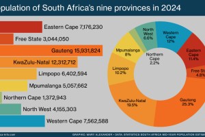
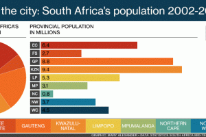
The population of each of South Africa’s nine provinces varies enormously. According to Statistics South Africa’s 2024 population estimates, the most populous provinces are Gauteng and KwaZulu-Natal, and the emptiest the Northern Cape and Free State.
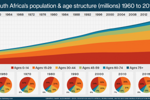
There’s a lot of talk of South Africa’s population being dominated by the youth. But we’re less youthful than we have been for decades. The end of apartheid, better healthcare, widespread social welfare and greater economic opportunities all mean South Africans are now able to live longer lives.

From 1960 to the late 1980s, apartheid laws kept families and communities in poor rural areas. Young men alone were allowed to move to the cities, where their labour was valuable. After the end of apartheid, from the mid-1990s, urbanisation increased rapidly.

In the West the peak of the Aids epidemic was in 1985. But HIV and Aids hit South Africa only in the 1990s, just as we were starting to build a new society out of the ruins of apartheid. Here, the epidemic peaked in 2006.
Key facts on South Africa’s currency, time, geography, population, languages, provinces, government and education.
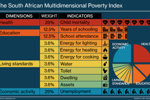
The South African Multidimensional Poverty Index looks at how poverty reveals itself in people’s health, their level of education, the dwelling they live in, how they cook their food, the water they drink …

Nearly a third of black South Africans speak isiZulu as a first language, and 20% speak isiXhosa. Three-quarters of coloured people speak Afrikaans, and 86% of Indian South Africans speak English. Sixty percent of white people speak Afrikaans, and 30% speak English.

South Africa has held three official censuses in its recent democratic history: in 1996, 2001 and 2011. The censuses have revealed both a growing population – from 41 million to 52 million – and a significant shift in the country’s racial profile.
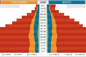
Black men have the shortest lives, and white women the longest. Find out more about the country’s population structure with this infographic charting the realities of age, race and sex in South Africa.

The death rate of children is the starkest indicator of the health of a country’s society and economy. In 1974 South Africa’s mortality rate – deaths per 1,000 live births – was 88.1 for infants under a year and 125.5 for under-fives. By 2016 it had dropped to 34.2 for infants and 43.3 for under-fives.
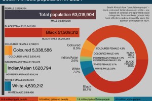
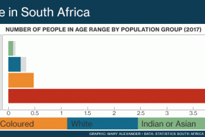
In 2024 South Africa had a population of 63 million. Black people were the majority at 51.5 million – 81.7% of the total. There were 5.3 million coloured people (8.5%), 4.5-million white people (7.2%) and 1.6-million Indian/Asian people (2.6%).
You must be logged in to post a comment.